
The Issue:
Income sources and expenses often operate on mismatched schedules. For example, a person might receive a paycheck every two weeks, but need to pay rent monthly and car insurance every six months.
These differing schedules can make it difficult for a person to visualize their cashflow.
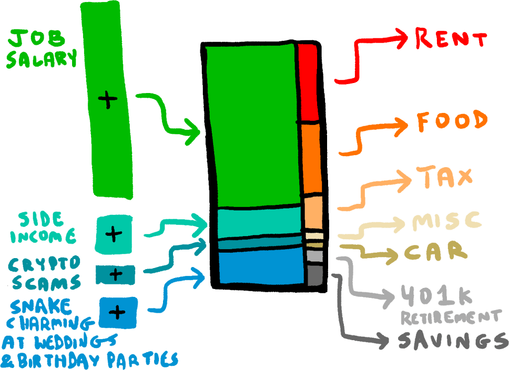
There are lots of ways to visualize income and expenses (e.g., Figure 1), but they all have the same problem: a change in income or expenses takes a long time to appear in the visualization.
Proposal:
We’d like the “income/expenses” graph to update quickly. Ideally, it would be immediately obvious on the data visualization if someone gets a promotion or stops ordering DoorDash, rather than being something a person has to wait several months to notice.
The solution is simple: let’s visualize income and expenses as a water faucet (Figure 2), where expenses are aggregated over a short period of time (e.g., hourly, or even per-second!).
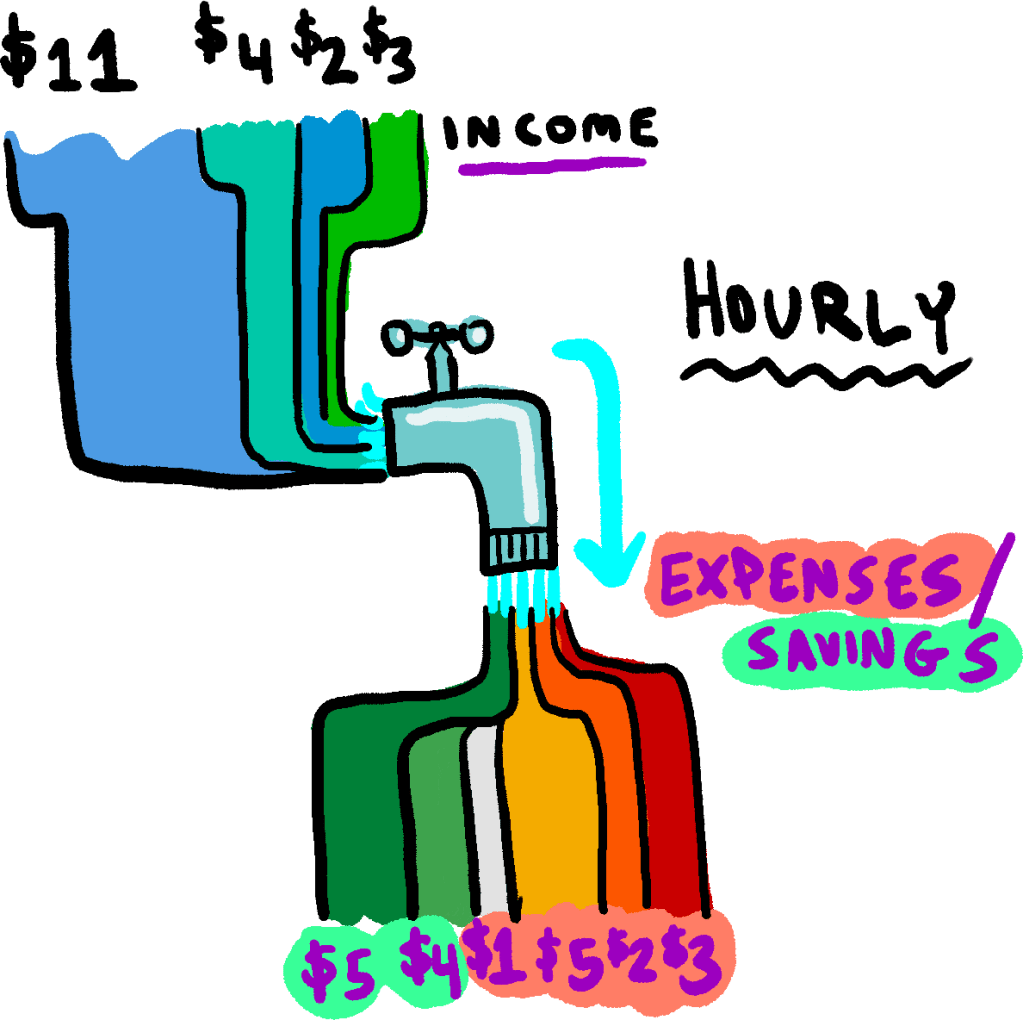
In the example above, a car insurance payment of $2400 per year would be represented as (2400 / 365 / 24 = $0.27 per hour). The benefit here is that if the user somehow reduces their insurance expenditure to $1250/yr, then the “faucet” will immediately and obviously update to $0.14 per hour. (The rest of the money would then go into the “savings” stream.
Conclusion:
Look for this feature to be added to all reputable (and disreputable) finance web sites!
PROS: Could provide people with a better idea of how to control their finances. It’s pretty obvious where the “water” is going in Figure 2, and people might be more motivated to solve the “leaking pipe” expenses.
CONS: Might misleadingly over-represent seasonal income during the “on” season, potentially lulling users into a false sense of financial security.
Originally published 2026-05-11.

You must be logged in to post a comment.