
The Issue:
When creating figures, it can be tempting to use misleading techniques in order to bolster one’s own agenda.
But it can be hard to create a misleading figure while technically representing the facts correctly, at least from a certain point of view (Figure 1).
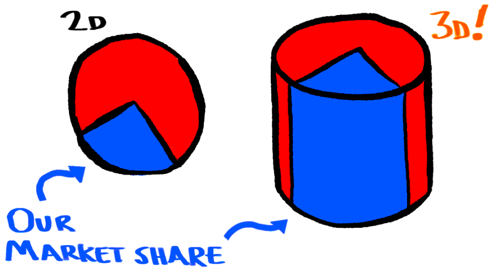
Fig. 1: The addition of a third dimension (right) to this pie chart really helps the blue stand out. It’s gone from a quarter of the “ink” on the page to over half! Misleading: yes. Factually incorrect: plausibly debatable!
Proposal:
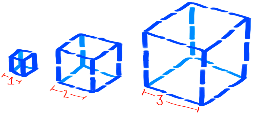
A popular—yet rarely formally acknowledged—method of creating misleading figures is to add additional spatial dimensions to them. Specifically, this allows us to vastly inflate the visual interpretation of a figure while technically keeping the numbers correct (Figure 2).
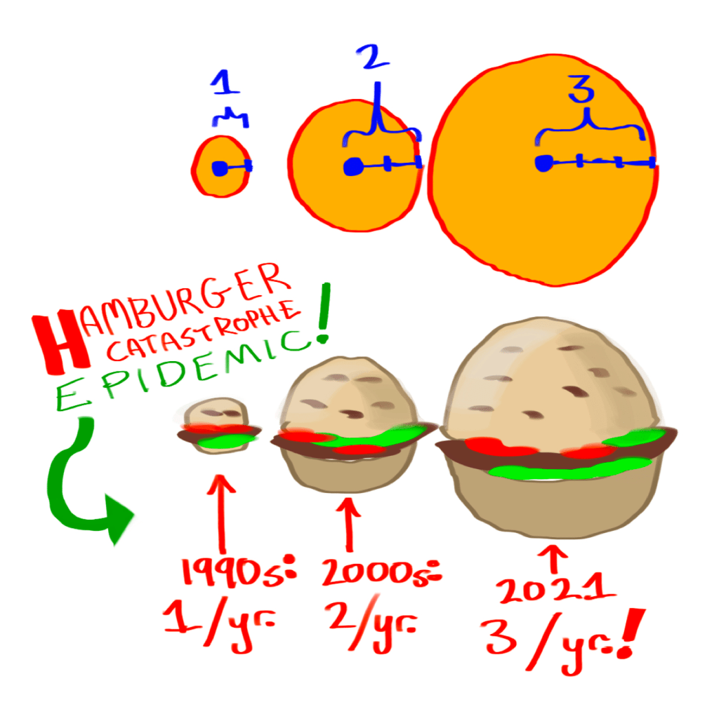
If we don’t need to use all three dimensions to inflate the apparent size of some numeric results, we can also just use two dimensions (Figure 3).
PROS: Provides misleading figures with plausible deniability. Use it on your clickbait blog today!
CONS: Unfortunately, four-dimensional (and beyond) figures are not practical to display to humans, so it isn’t possible to, say, inflate a 20% increase to a 700x-increase (≈ 1.2036) by displaying it in the 36th spatial dimension.
P.S. Regrettably, it appears that this exact topic was covered in the 1954 book How to Lie with Statistics.

You must be logged in to post a comment.