
Background:
Two obvious qualities that contribute to making an alphabet “good”:
- It’s quick to write.
- The letters can be distinguished unambiguously.
(Information density might also be worth considering—we don’t want the letters to take up too much space—but we’ll be ignoring it here.)
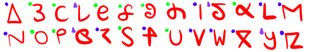
Sometimes, speed-of-writing and ease-of-reading is a tradeoff: consider the shorthand shown in Figure 1.

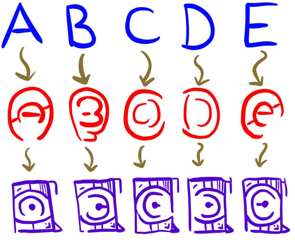
As shown in Figure 2, it’s also possible for an alphabet to be strictly worse than another one.
Proposal:
If we want to improve the Latin alphabet, we’ll need to:
- Maximize distinctiveness of each letter.
- Minimize the amount of time required to write each letter.
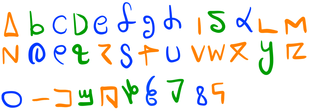
We will also be trying to avoid mirror-image letters (e.g. p / q / b / d). Figure 3 shows how confusing a “minimalist” set of letters can be if we aren’t already familiar with them.

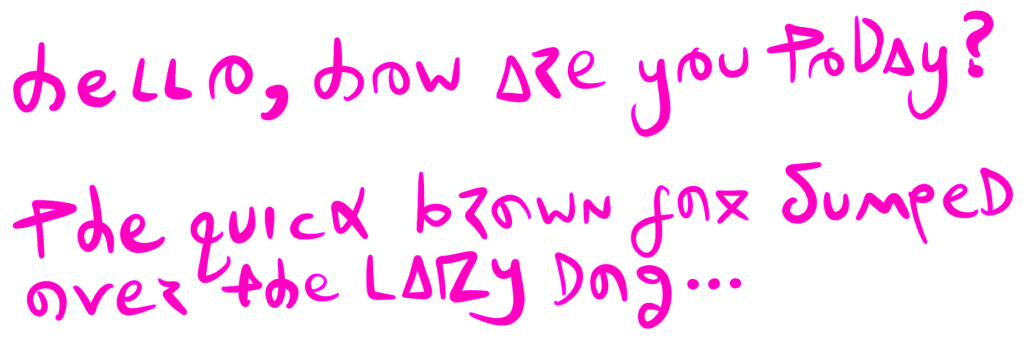
Let’s attempt to reform the Latin alphabet for ultimate readability: the new Alphabet Version 2.0 is shown in Figure 4, with an example in Figure 5.
Naturally, we would also need to get rid of the bizarre and depraved historical accident that led to both a set of “lower-case” and “upper-case” Latin letters. Two alphabets seems especially excessive when we consider that the main use of capital letters is for YELLING ON THE INTERNET. This could be equally accomplished by adding a * or # before each word that should be yelled.
Conclusion:
Write a letter to your local school board and demand that they teach this new “updated” alphabet to students so they don’t fall behind in the future.
Related work: This is similar to the April 2, 2018 idea about disambiguating certain letters / numbers (e.g. zero (0) and the letter “O”), but now we’ve applied these optimizations to the entire alphabet!
PROS: This new alphabet would be both faster to write AND easier to read!
CONS: All previous signage and literature would need to be revised to this new system. But this is actually also a positive, because it would create new jobs!

You must be logged in to post a comment.