
Background:
Supposedly, the proliferation of ubiquitous GPS has lead to humans being worse at navigating, the presence of calculators has rendered most people incapable of doing even basic mental math, and the existence of written language has made humans worse at remembering things more generally.
Proposal:
In order to combat this “things are too easy” trend, we recommend that software become intentionally harder to use. The open source community is already on top of this trend, as are late-2010s mobile app developers (perhaps most famously, Snapchat).
Specific issue: Color pickers
This proposal is limited to a basic enhancement of color pickers (Figure 1): by rearranging the location of colors, we can cause users to spend more time trying to find the color they are looking for, which both 1) promotes brain development and 2) increases engagement with the app. For mobile apps, increased engagement (i.e., time) also translates to more opportunities to show ads to the user.


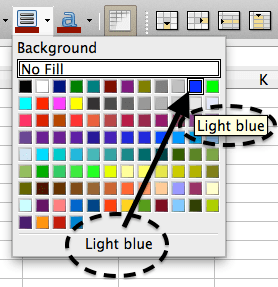
An “enhanced” color palette could look like the default one from 2014 LibreOffice (Figure 3): the seemingly random arrangement of strange and uncommon colors (with a few duplicates) means that the user will need to be fully engaged with the color picker panel in order to make sense of it.


Fig. 4: LibreOffice has, strangely, refashioned their interface; the 2016 default (at left) is now arranged in a fashion similar to other software’s color pickers.
Conclusion:
When designing a commonly used user interface element (for example, a color picker, “save file” dialog, list of email addresses, a phone dialer, etc…), you should try to consider: how can I make this element “more engaging” to the end user? Don’t let the user’s brain coast on auto-pilot—make them work for every interaction with your interface.
PROS: Improves neural connections and promotes a hard-working self-reliant attitude.
CONS: Entitled end users will whine about your decisions!

You must be logged in to post a comment.