
The Issue:
Sometimes, navigation signs need to distinguish between “forward” (usually indicated by a “⇧” symbol) and “up” (on a higher floor). Unfortunately up is frequently represented by the same symbol (Figure 1)!
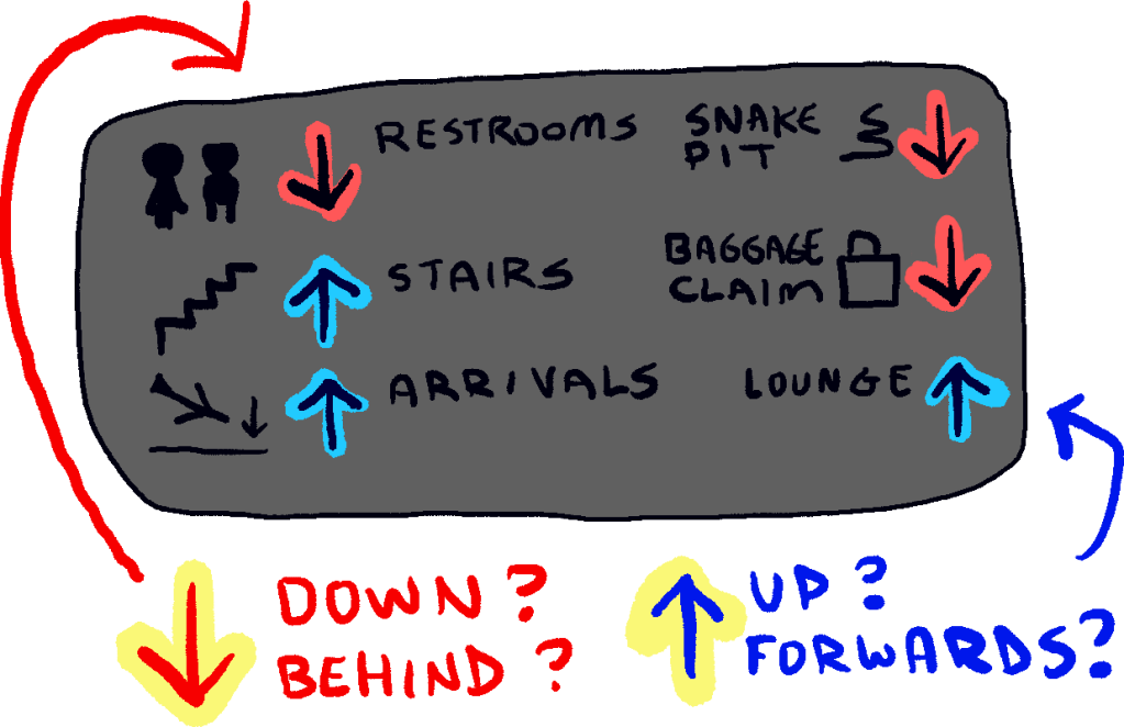
This navigation issue is frequently observed in airports and multi-level stores.
Proposal:
The solution is simple: instead of using a “plain” arrow for everything, just use different symbols for up / forward and down / backward (Figure 2).
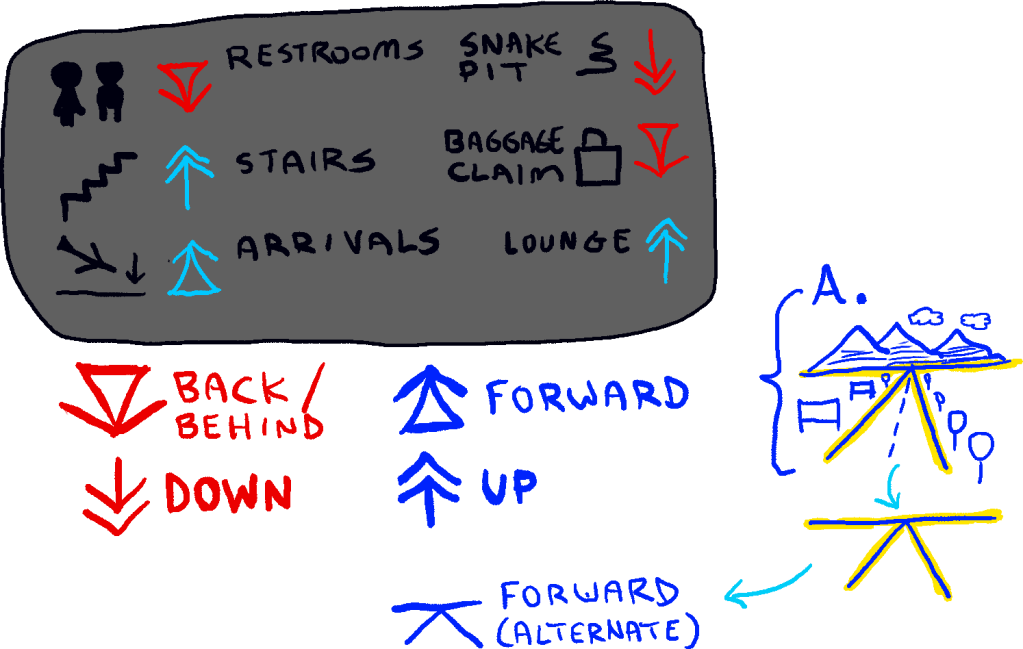
The only downside is that people would need to get used to these new symbols: otherwise, they’re just another perplexing symbol.
A Practical Alternative:
As an alternative to the symbols shown in Figure 2, we could also use the following arrows that are already available in the Unicode spec (and thus are available on computers right now):
- Up: ↟ (double arrow)
- Forward: ⇡ (as a mnemonic, the dots are footsteps)
- Down: ↡ (double arrow)
- Backward: ⇣ (as a mnemonic, the dots are footsteps)
PROS: Reduces confusion when navigating airports and department stores.
CONS: Increases confusion by adding new meanings to subtle variants of the “arrow” symbol.

You must be logged in to post a comment.